Material and Crafting System
Primary Purpose of Materials -
To craft powerups.
How to attain Materials?
Each obstacle drops 1 of its respective material.
For example -
- Vulcanian Moons, Vulcanian Asteroids and Vulcanian Comets all drop 1 Magma.
- Terrestrial Moons, Terrestrial Asteroids and Terrestrial Comets all drop 1 Gravel.
- Cryogenic Moons, Cryogenic Asteroids and Cryogenic Comets all drop 1 Ice.
Upon being collected a sound effect should play -
Some sample sound effects from freesounds that could be used (after trimming if necessary) -
The materials counts could be viewed in game on the upper left hand side as shown in the mockup below -
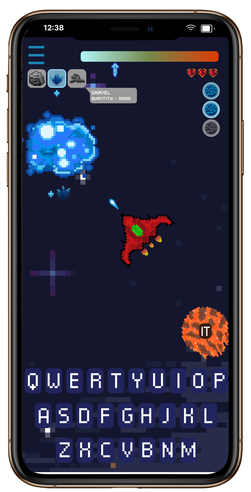
Upon destruction of the obstacle the material fades from its location and the material icon of that material could glow (In the case of the mockup the ice material glows and vibrates because a cryogenic moon was destroyed.)
A little plus icon below the material collection icons on the upper left side along with a plus icon near the obstacle exploded could also be helpful.
After 2 seconds the material icon could go back to grey as the gravel and magma icons look in the mockup.
If the player clicks on the icon a pop up could show how many of that material they currently own. In the mockup an example of this is shown for the Gravel material.
Kinds of materials available -
1. Gravel - Terrestrial types.
2. Magma - Vulcanian types.
3. Ice - Cryogenic types.
Powerups usage -
One time per charge.
They can be equipped before a match.
User Flow -
Version 1 -
When the player clicks on a planet a pop-up menu shows up showing the player's current inventory.
Players can also view all powerups purchased and craft in this menu itself.
If spaceship types are being introduced maybe better spaceship types could have more inventory space for more powerups? Or more space for powerups of a specific type? For example - ice themed space ships can carry 2 ice based power ups.
Mockup 1 -
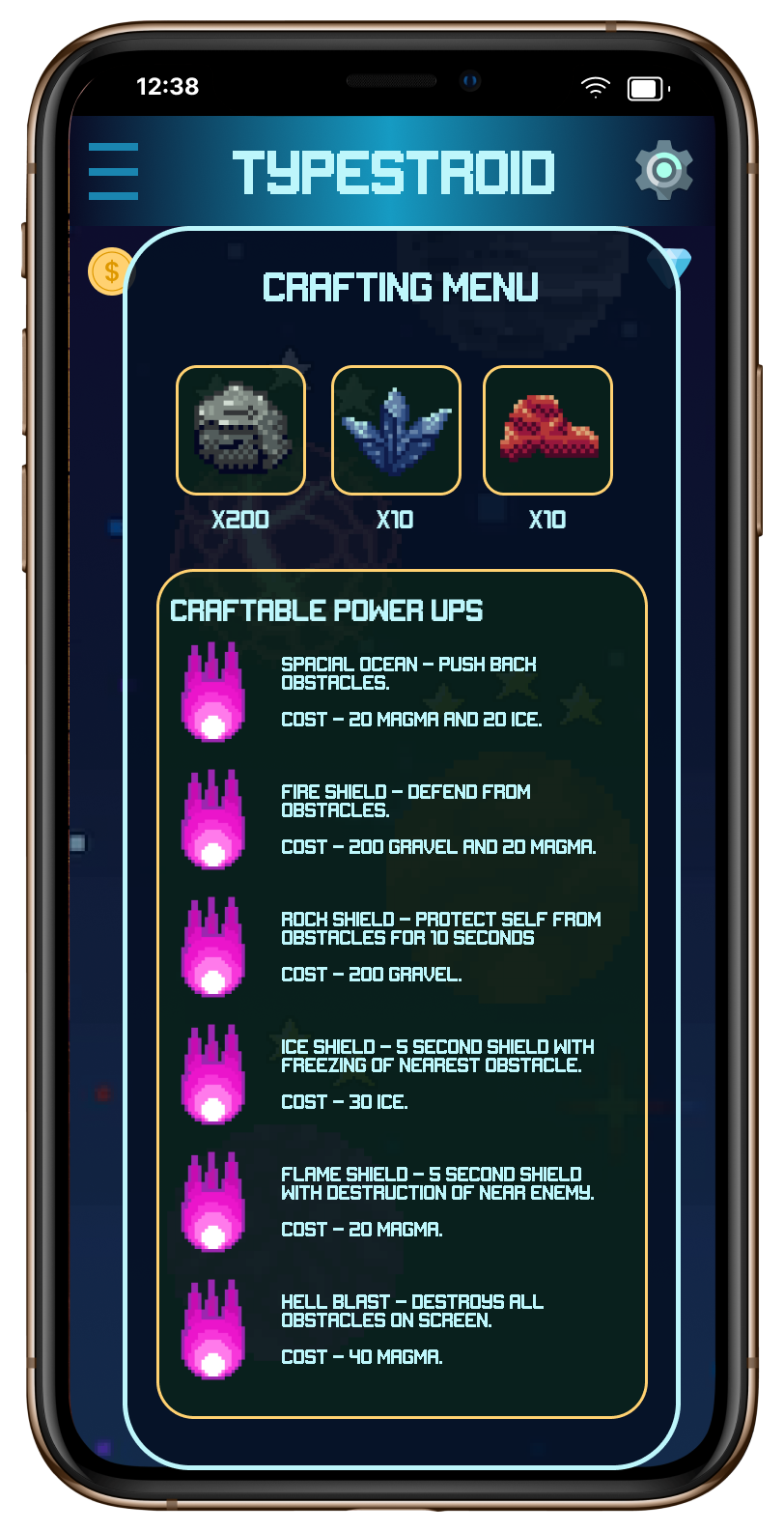
Realised this version had a lot of features missing.
Mockup 2 -
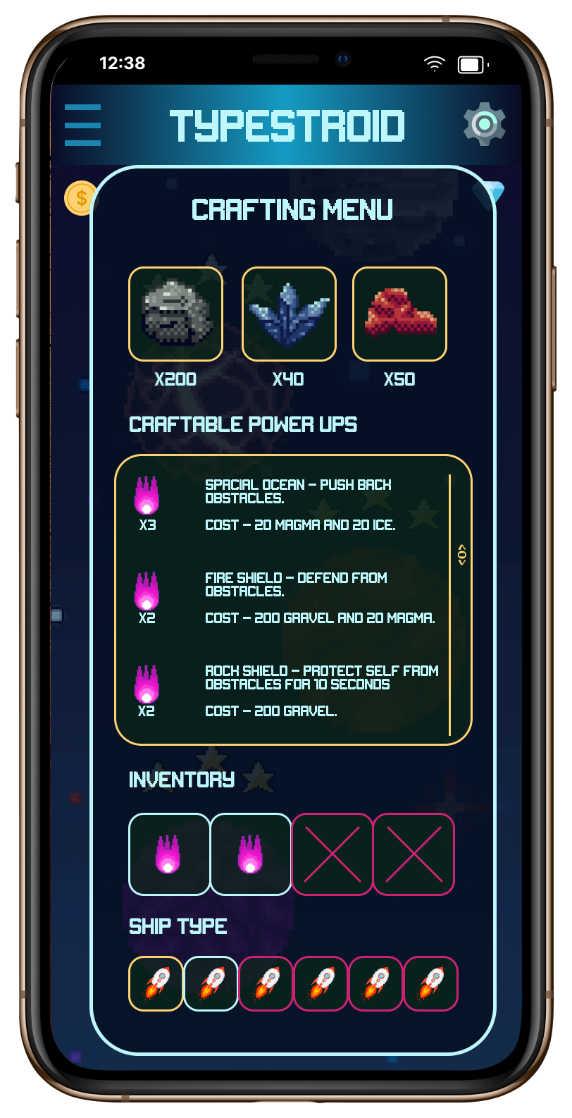
This version has most necessary features.
The top shows the three materials and the amounts the player has.
Below that the player can scroll through the different powerups that can be crafted, their requirements and on the left they can see how many they currently own of each type.
Below that is the inventory available with that particular ship variant.
Since the second ship is selected only the first two slots of pour ups are available. Currently selected items/ships are highlighted in blue. Available / interactable items are highlighted in a yellow border while currently locked items are highlighted in a magenta.
Mockup 3 (Made in Godot the last two were in figma) -
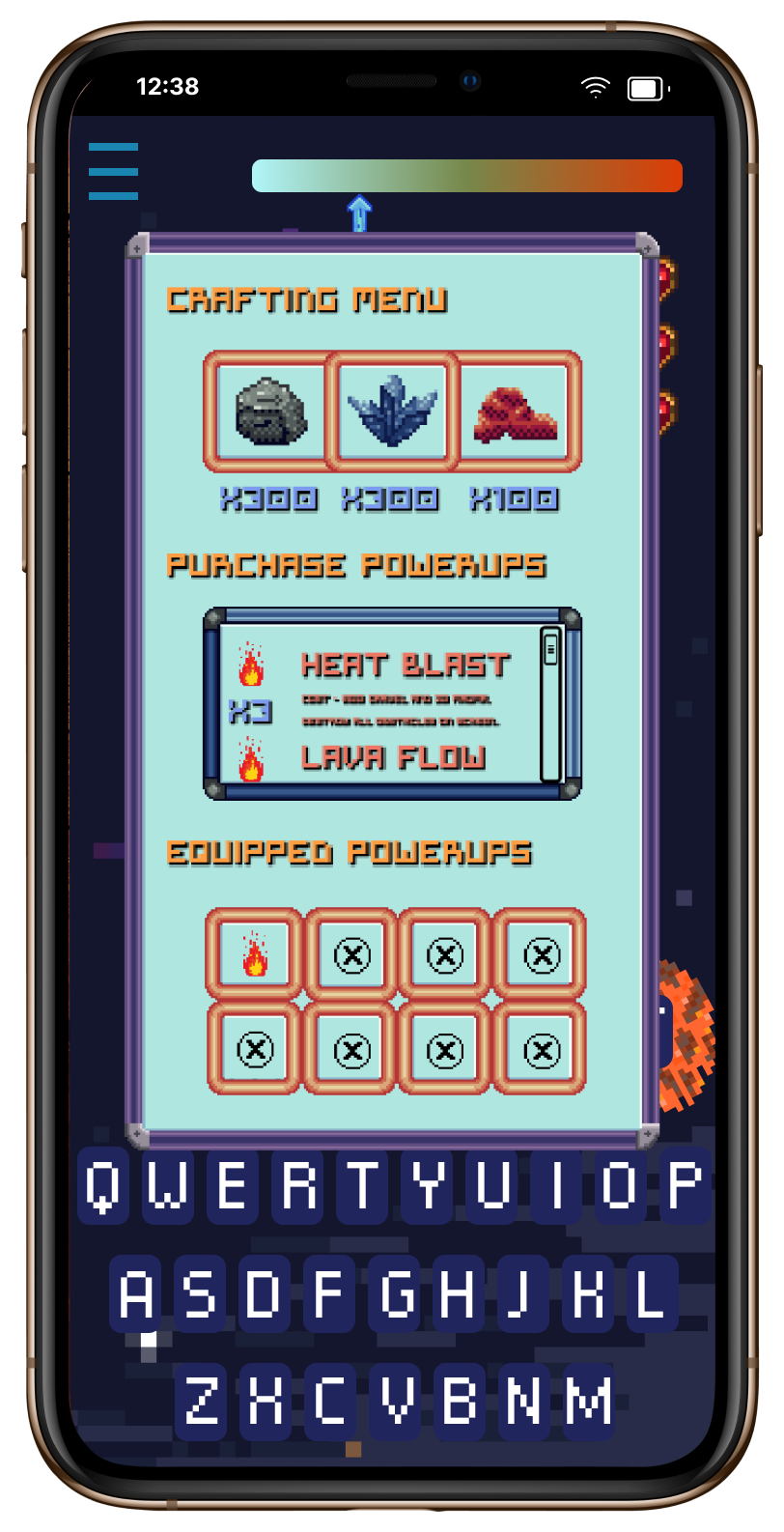
Utilized the panels I made yesterday to create a rough interface.
In this example the user is able to access the crafting menu in a match which may be too overpowered (like Resident Evil games).
Imagined user flow -
- User needs a power up to defeat a certain level.
- They click on the crafting icon available on the main menu. This icon could be a hammer or something similar.
- After this players can view how many of each material they have and how many powerups they have already purchased.
- Players can scroll and click on any powerup they want which will create a pop up that asks them if they are sure and want to spend that amount of craftables to purchase the powerup.
- After this if the player clicks yes it is purchased.
- Players can then drag and drop the purchased power ups from this scrollable menu to the inventory tab below which shows equipped powerups. The black "Xs" show slots that haven't been unlocked yet.
- Inventory space frees up when the powerup is used or when the player drags it from the inventory slot back to the purchase powerups menu and keep it in storage.
Inferences - A bright blue background doesn't look as good as I hoped. Will try darker colours paired with a lighter text so as to better simulate a space like feel.
Mockup 4 (Refined Mockup 2)
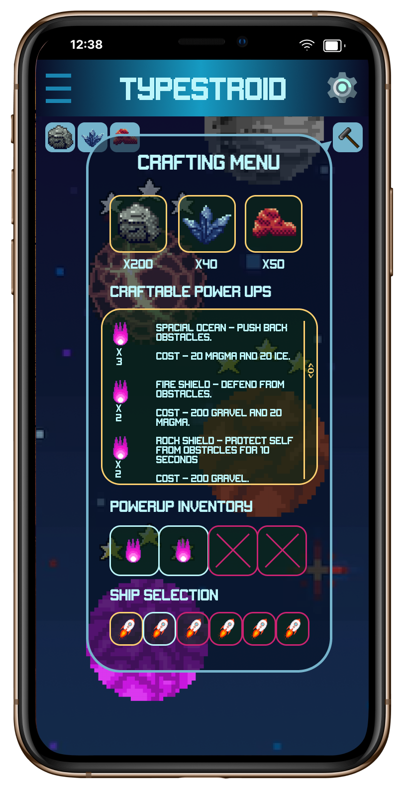
In this version the menu for crafting is a pop up from the hammer icon on the upper right corner on the main menu.
Quantiies of the three materials are available for viewing at base without even opening this menu at the same place they would be visible in game.
Inferences - A transparentish pop up feels cleaner. The border of the pop up matching the border of the base of the buttons makes it more coherent. Worded the displays to better describe what they label for example - "powerup inventory" and "ship selection".